gourmet theater
in a nutshell
The Gourmet Theater is a one-of-a-kind dining event that transforms food into performance. Each edition brings together new chefs, themes, and locations, making every experience unique. Acting as a stage for culinary creativity, it invites chefs to push boundaries and craft immersive journeys for guests.
The identity was designed as a cinematic, flexible system: dramatic and mysterious, yet adaptable enough to evolve with each event. Like a blank stage awaiting its next production, it balances consistency with reinvention, offering a recognizable platform while allowing each performance to shine.
the challenge
Every Gourmet Theater event is distinct, but the brand itself needed to remain cohesive and recognizable. The challenge was to create a system that adapted to shifting themes, locations, and lineups without overshadowing them. Ensuring each night took center stage while the Gourmet Theater brand built long-term recognition.
As a traveling pop-up, the identity also had to support localization in different languages and markets, while establishing a visual thread strong enough to be recognized over time. The task was a delicate balance: flexible yet structured, adaptive yet unmistakable.

how we got there
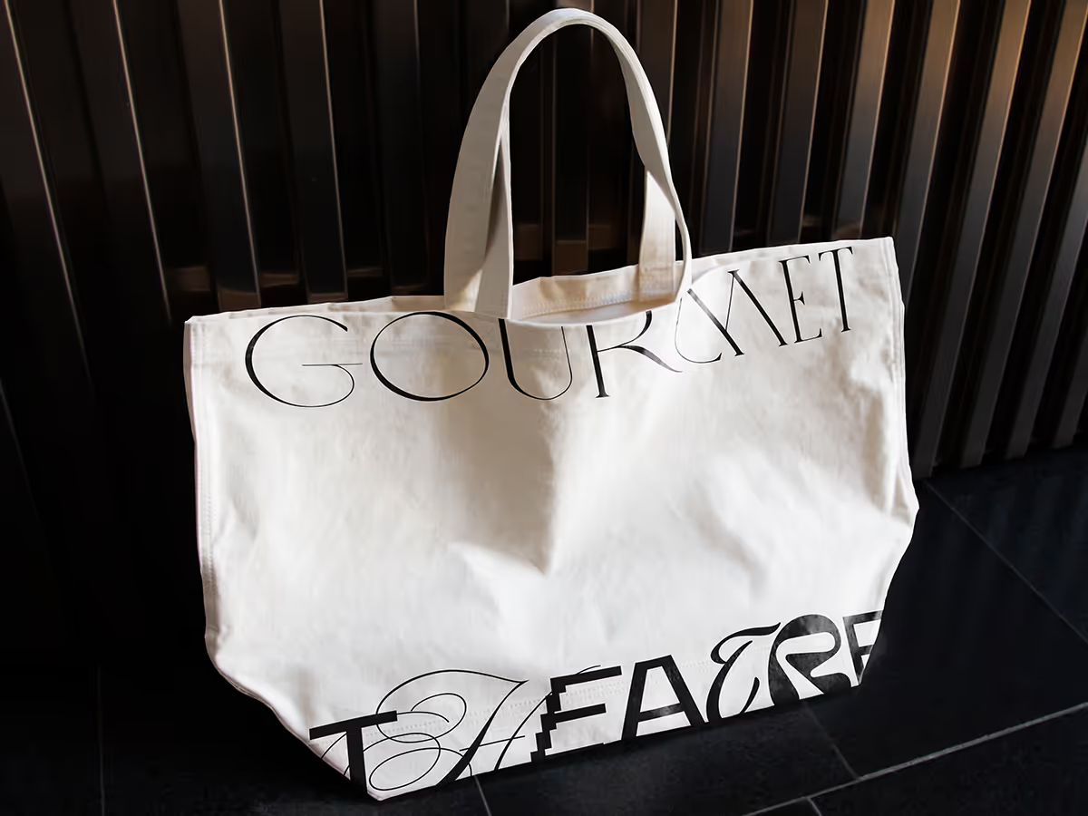
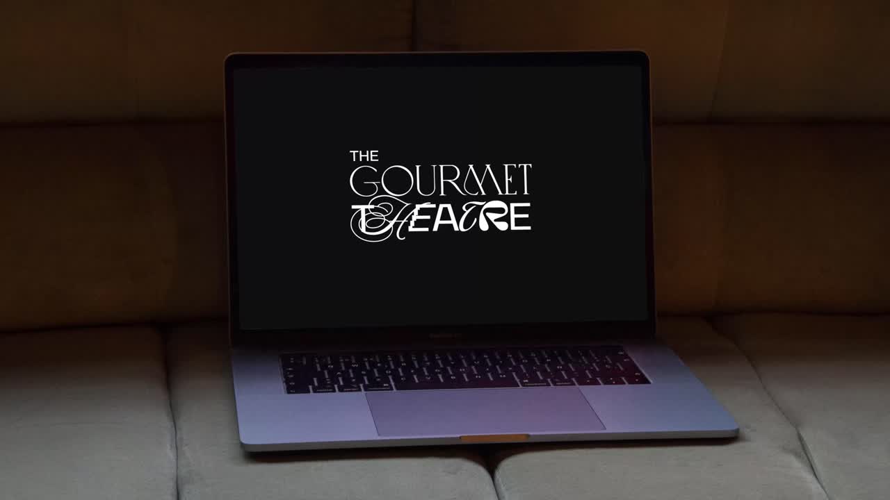
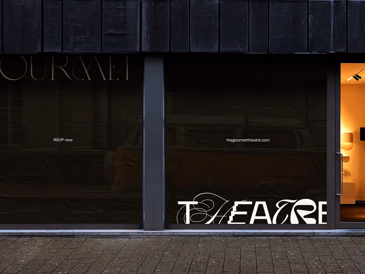
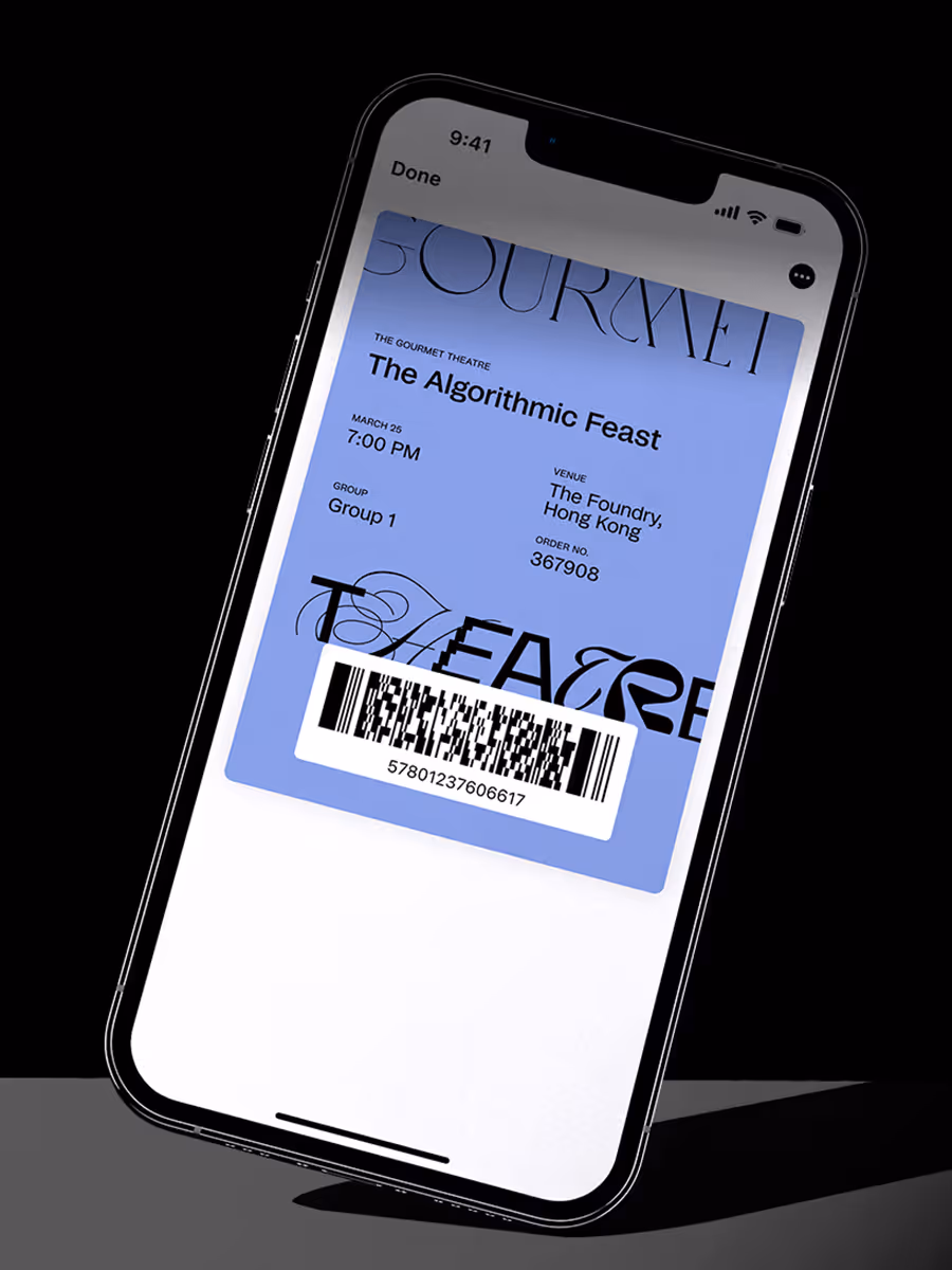
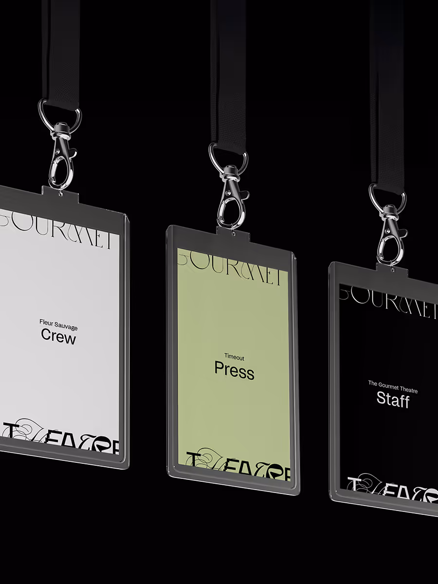
At the heart of the system is a dynamic logo. The word “Theatre” is constructed from multiple typefaces, symbolizing the gathering of diverse talents. This shifting yet harmonious mark became the perfect metaphor: never the same twice, but always gourmet theatre.
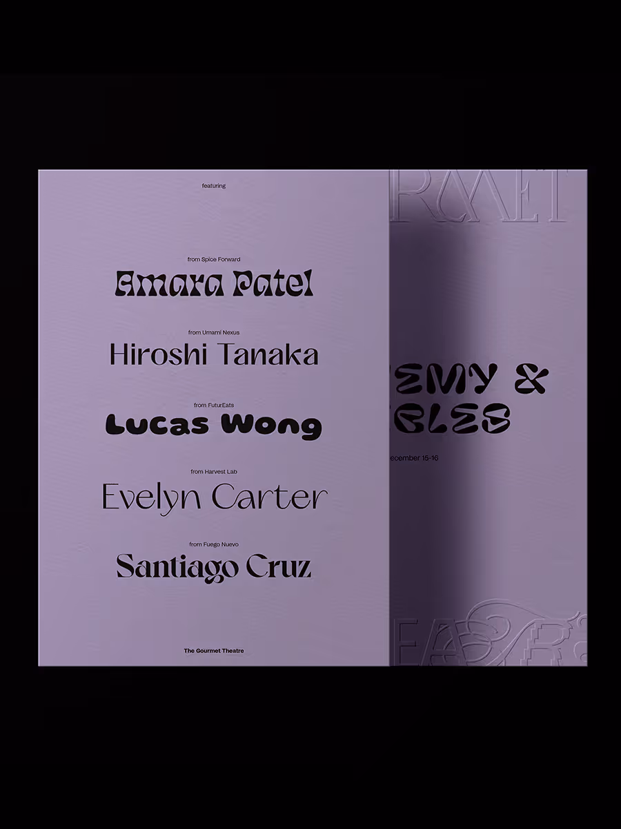
Typography was designed for adaptability, leaving space for each event’s theme and chef lineup to influence the look. This openness allowed the system to support localization and align with diverse culinary cultures.
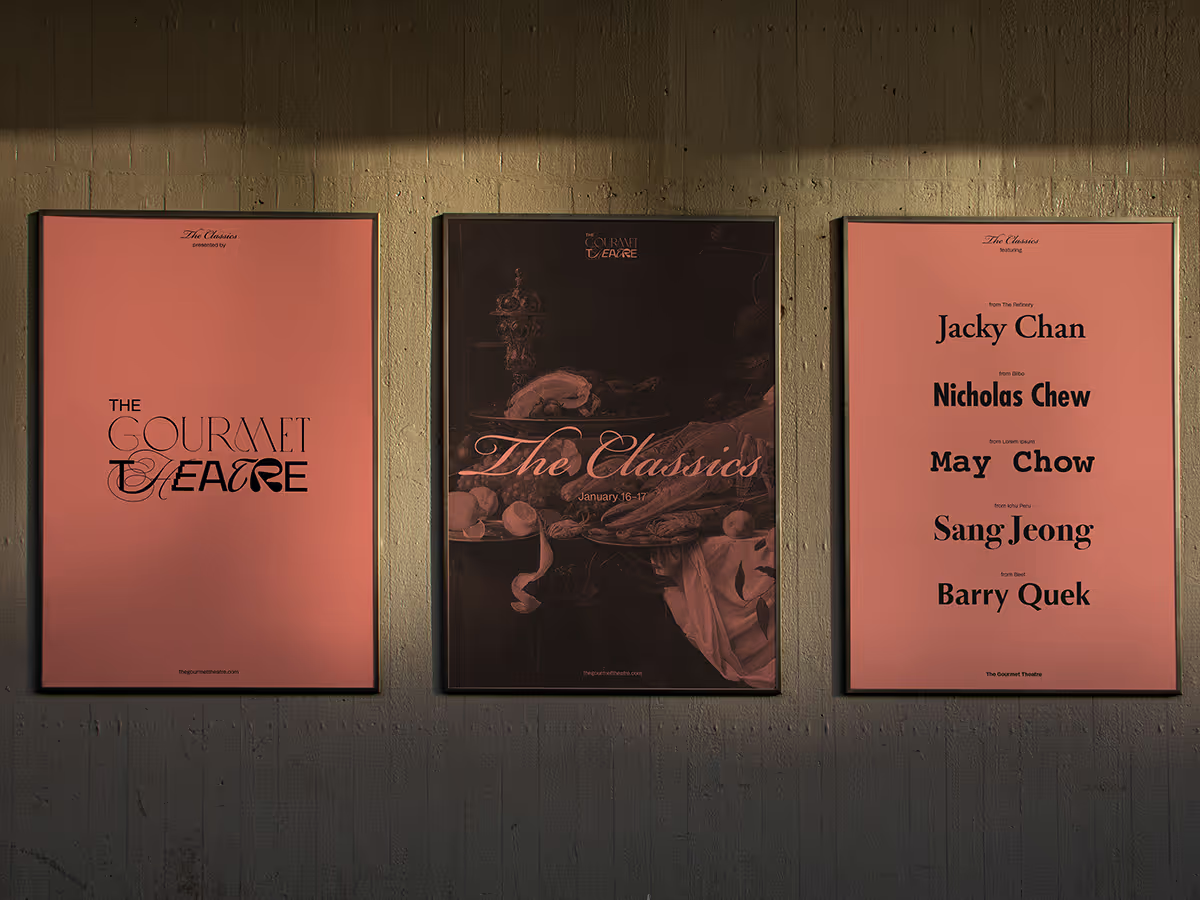
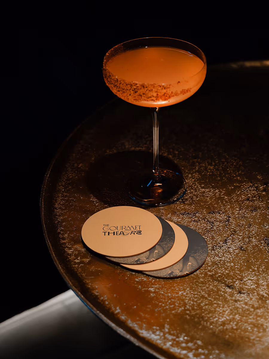
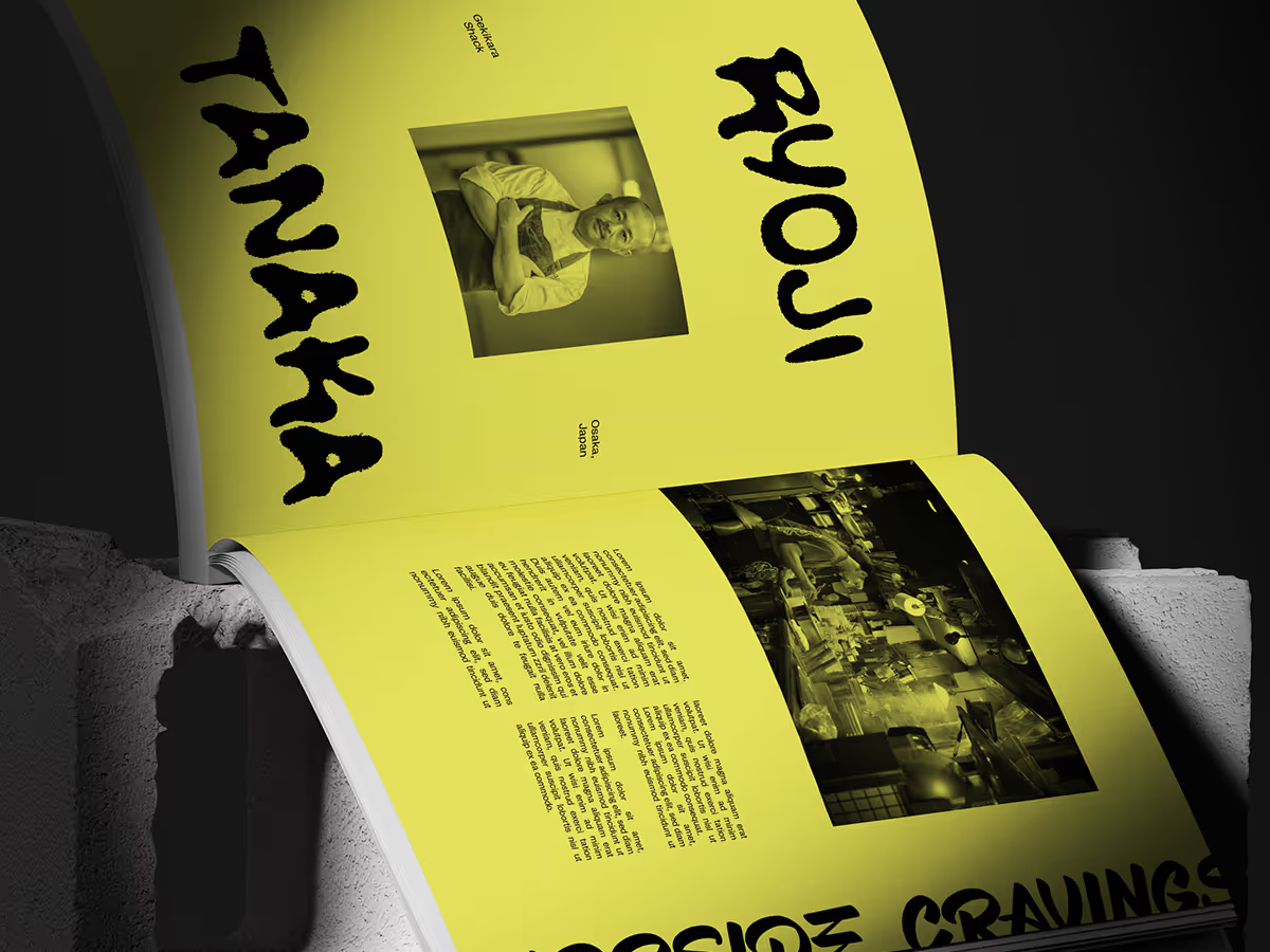
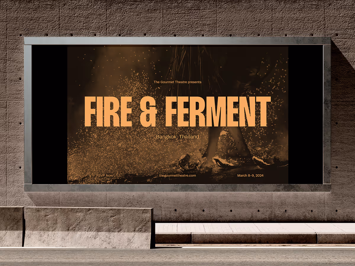
Every edition is anchored by a key visual built from three elements: monochromatic photography, a signature color, and theme-specific typography. Treated consistently, these visuals created a cohesive foundation across posters, menus, tickets, and digital platforms while leaving room for each theme to breathe.
Crucially, the design avoided surface-level cultural references, instead drawing on research into local food culture. This ensured every event felt authentic and respectful while still dramatic and immersive.

the hat(s) I wore for this project
As one of two lead designers, I co-directed the identity from concept through execution across print, digital, and environmental design. While responsibilities were shared, I took the lead on motion graphics, an essential component of the brand’s online presence.
Motion was used to weave cinematic drama into the system: a shifting logo echoing ever-changing lineups, stage-like framing inspired by curtains, and parallax effects that gave visuals depth and theatricality. Defining how these elements worked consistently across platforms ensured the brand remained flexible but cohesive.
My role was about more than just execution, it was about building a system that could evolve with every performance while retaining a clear, recognizable identity. The result is a brand that feels alive, adaptable, and unmistakably Gourmet Theater.