chako
in a nutshell
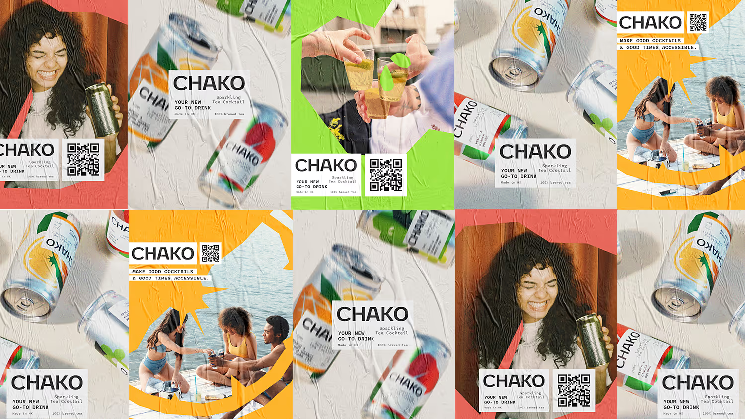
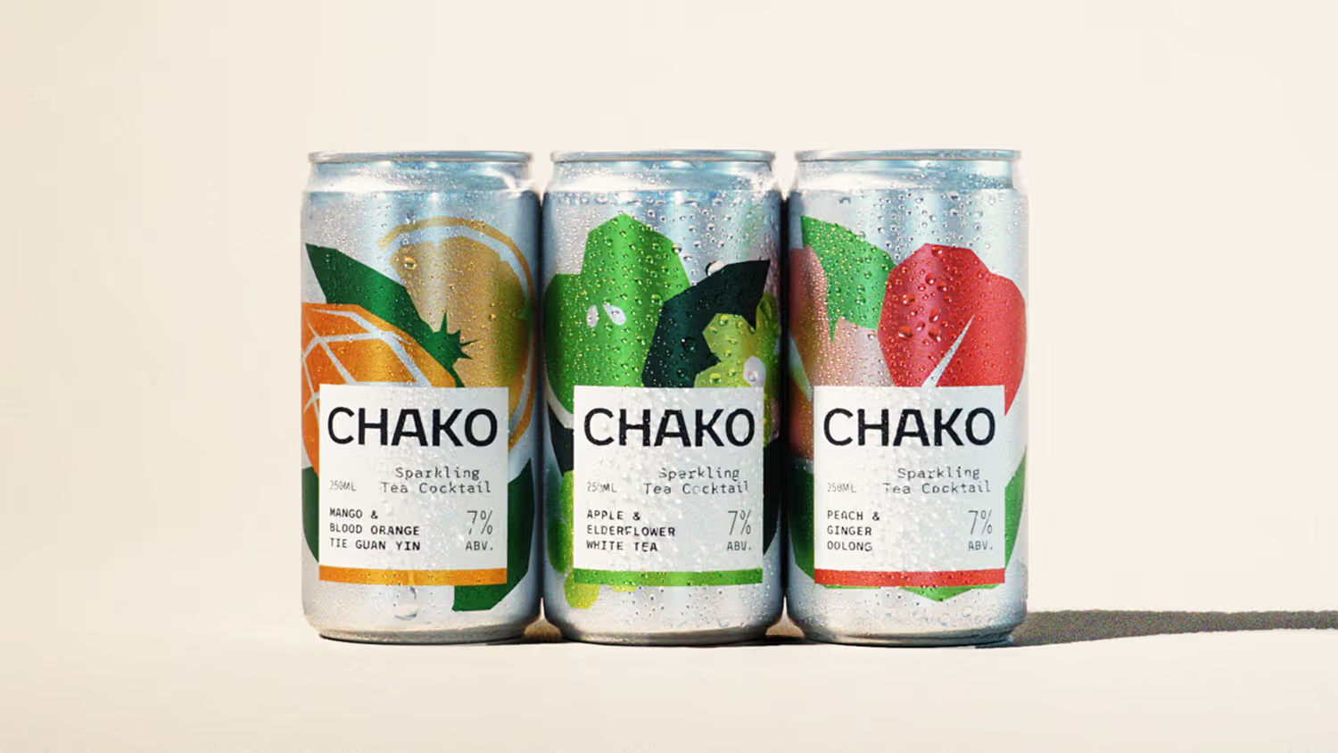
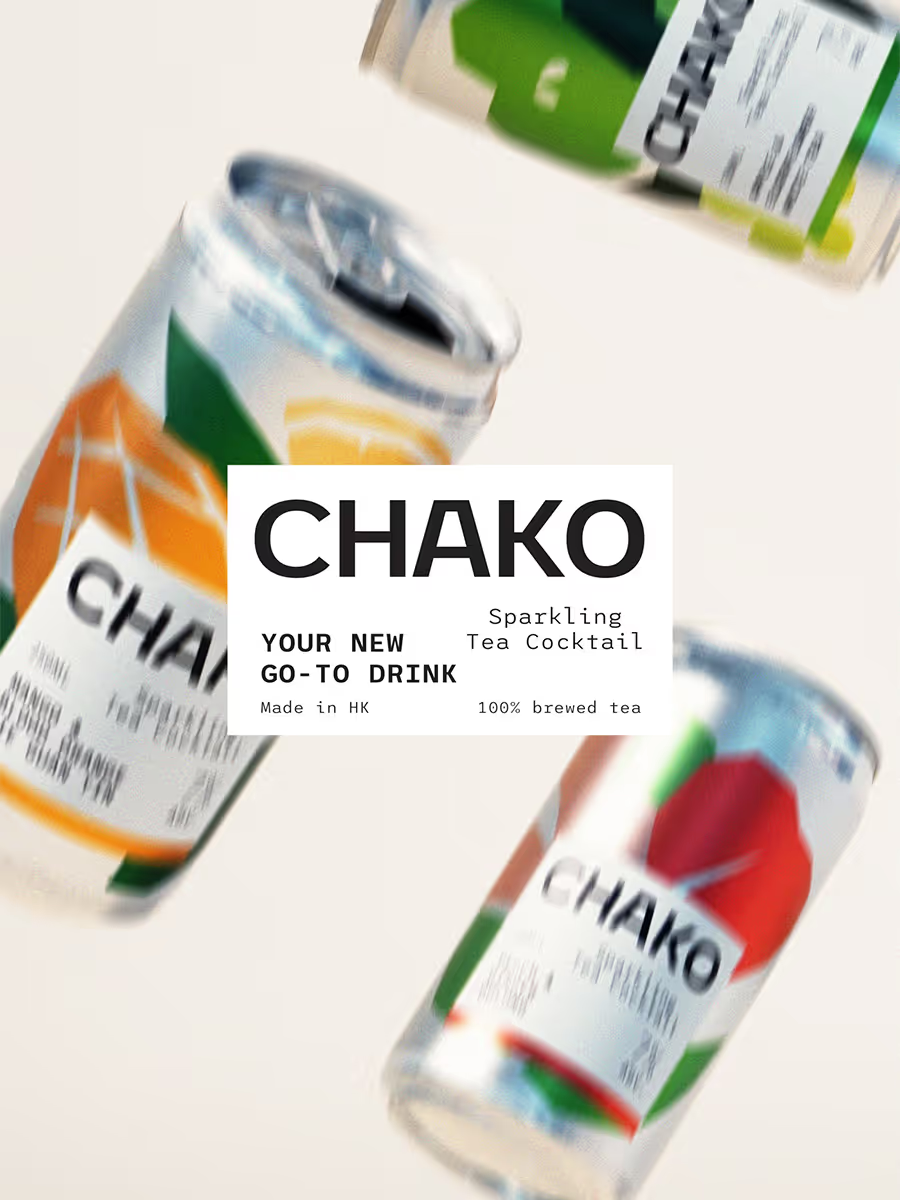
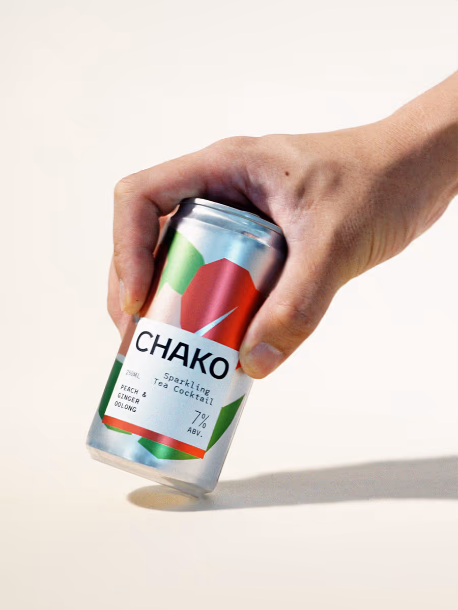
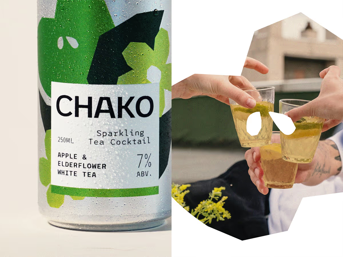
Chako is a ready-to-drink canned cocktail created by Antonio Lai, Alex Ko, and Tastings Group, the team behind some of Hong Kong’s most acclaimed bars. Designed for a young, casual audience, Chako delivers bold flavors made for the can, not imitations of classics. The identity reflects this originality: bright, abstract shapes paired with clean typography and ingredient transparency.
Launched in 2022, Chako quickly earned recognition from Drink Magazine Asia, Time Out, and a Silver at the Transform Awards Asia for Best Visual Identity in Food & Beverage.
the challenge
Hong Kong’s shelves were crowded with beer and a few seltzers, but lacked diverse, high-quality ready-to-drink options. The pandemic accelerated demand for convenient, bar-quality drinks at home, yet existing choices felt limited and uninspired. Chako set out to fill this gap with a product that was approachable, fresh, and premium, built for casual enjoyment beyond the bar.
how we got there
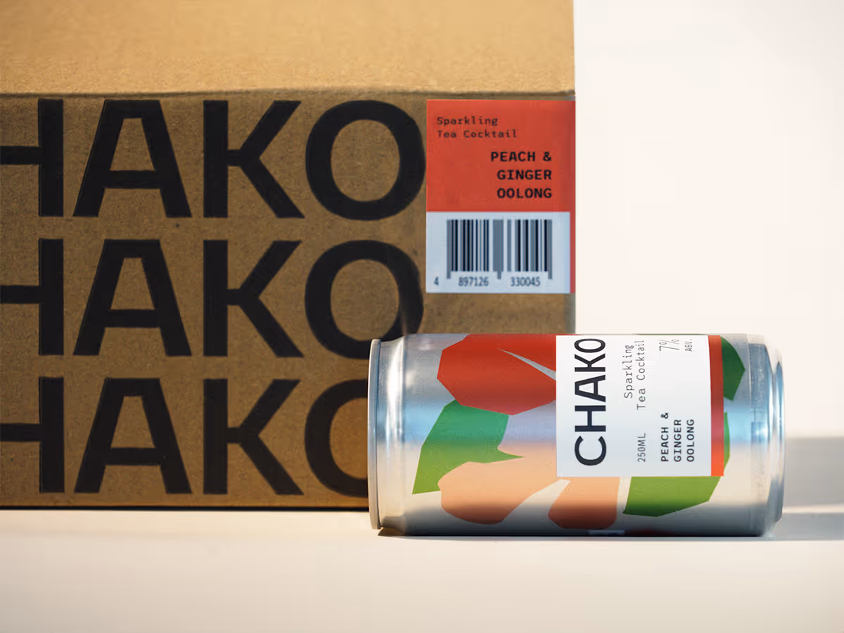
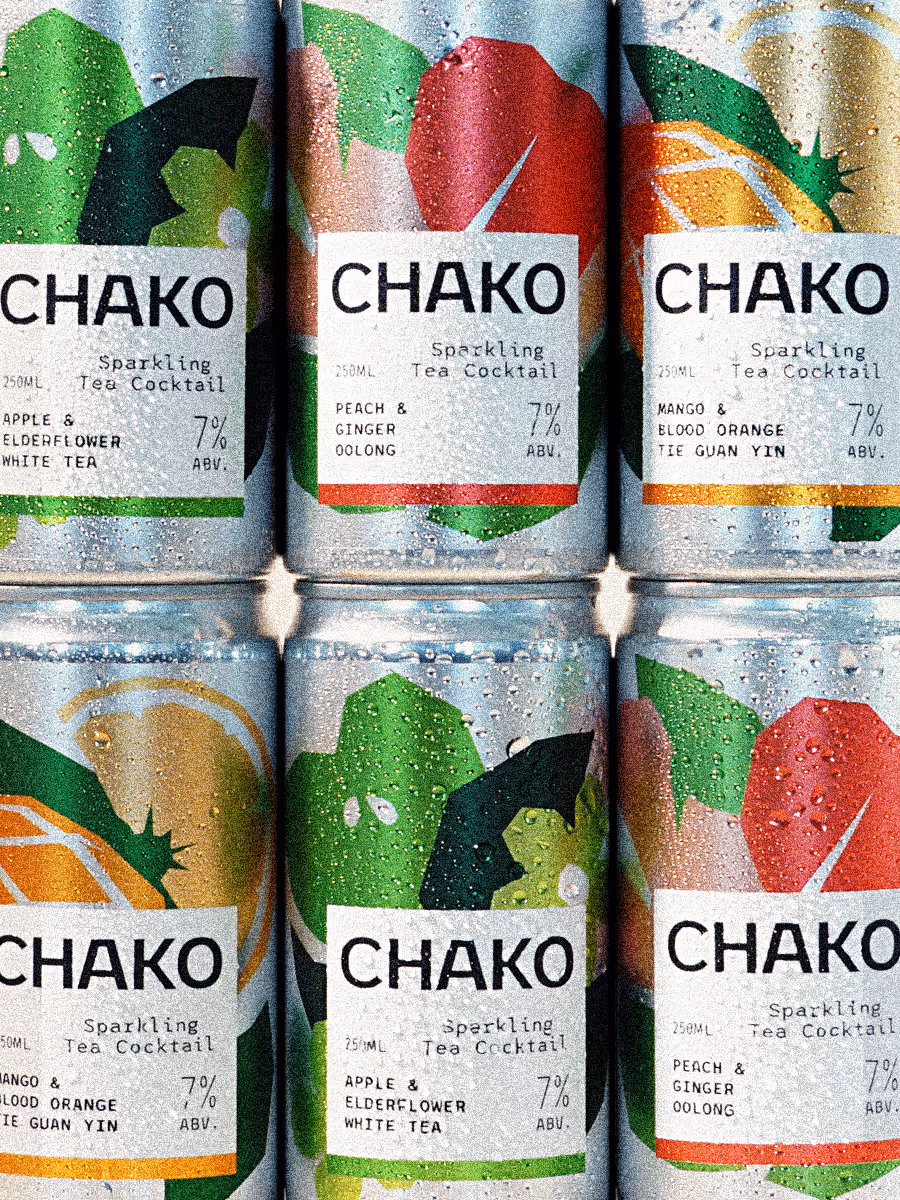
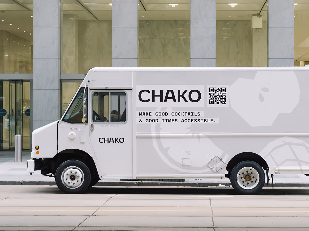
We positioned Chako as a trustworthy, high-quality choice by spotlighting ingredients and building a clear, scalable system for packaging. In crowded retail environments, cans needed to stand out fast while staying approachable and consistent across SKUs. The visual system used abstract illustrations, strong color blocks, and a label design that makes flavors and ingredients instantly clear. This created a shelf presence that’s both eye-catching and functional, with built-in scalability for future product lines.

the hat(s) I wore for this project
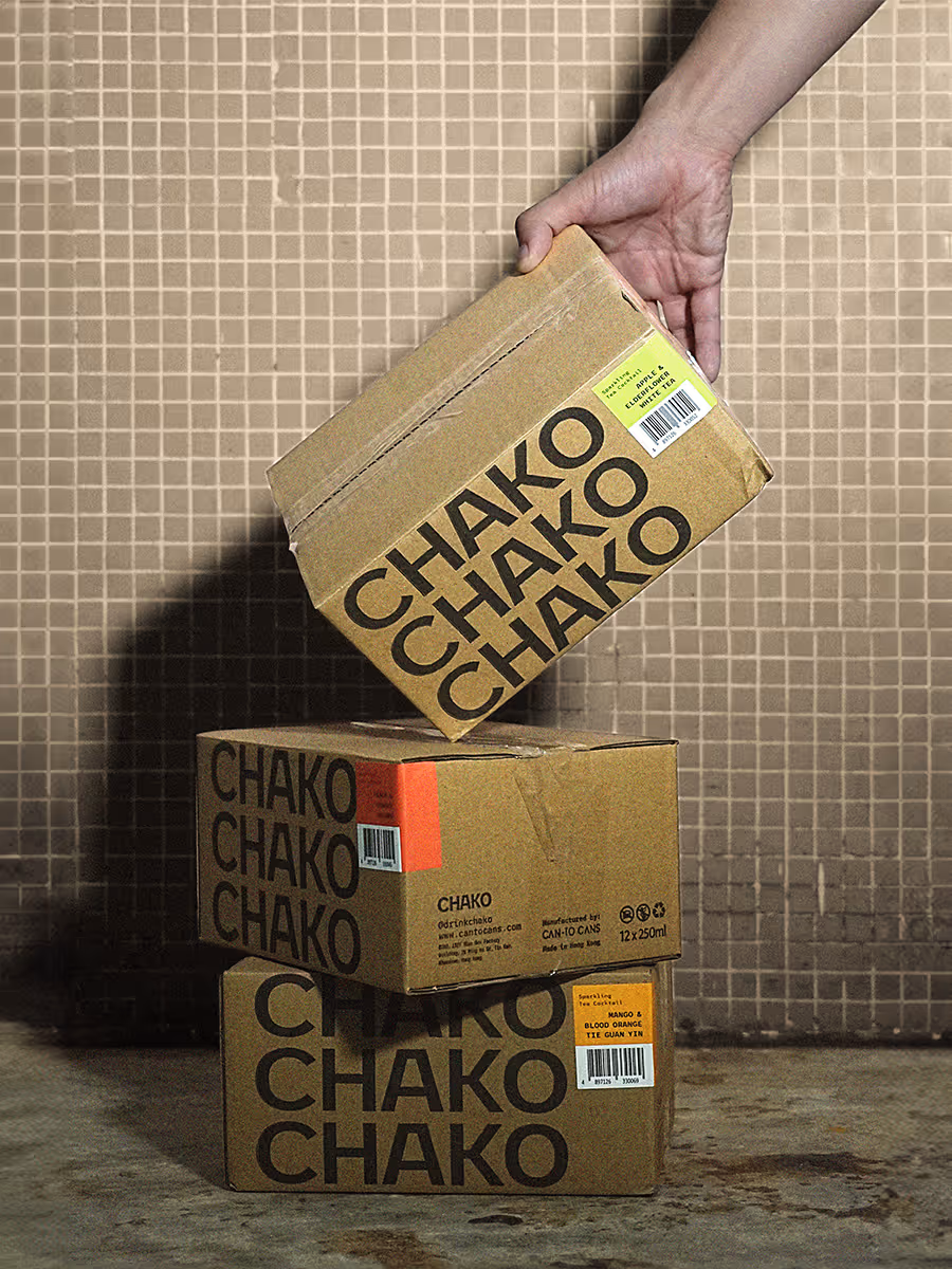
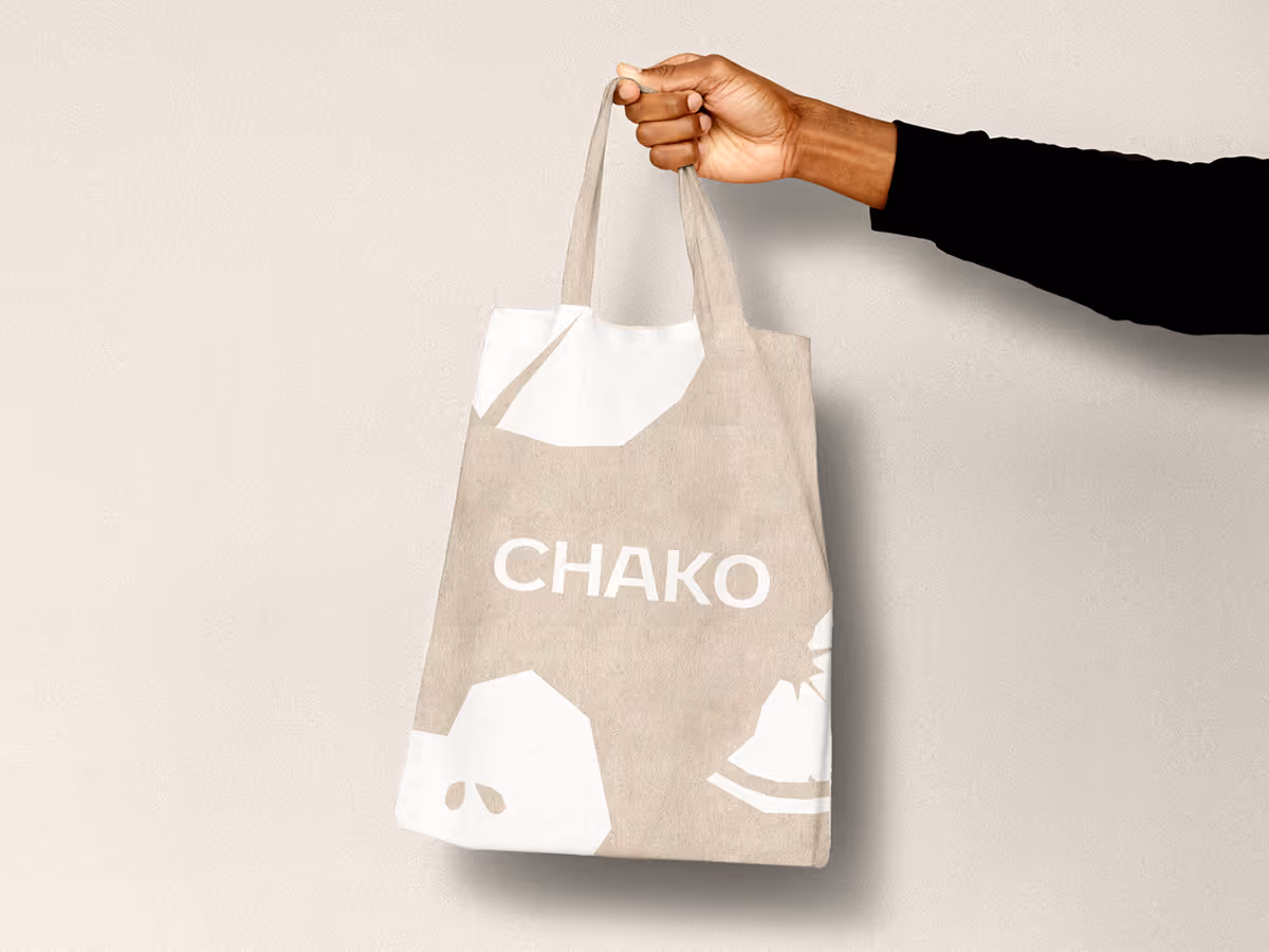
As the design lead for Chako, I was responsible for shaping the entire visual identity from start to finish. I directed the art and developed a system that could flex across packaging, guidelines, photography, and social assets, ensuring consistency at every touchpoint. Scalability was a central focus: I designed a modular system that allowed clear differentiation between SKUs while maintaining a cohesive line, supported by templates and documentation to help the brand grow seamlessly.
A highlight of the project was creating the illustration style, inspired by the tactile process of paper cutting. This approach gave the brand a distinct, handcrafted character, simple enough to scale across new SKUs, yet unique enough to stand out on crowded shelves. Throughout, I collaborated closely with the creative director and client team, refining the work to balance boldness with approachability and aligning the system with real-world production needs. My involvement across strategy, design, and execution ensured that Chako’s identity not only launched strong but was built to evolve confidently as the brand expands.