bakehouse website
in a nutshell
Bakehouse built its reputation on delicious pastries and neighborhood charm, but its website wasn’t keeping up. As the brand grew, customers, partners, and job seekers struggled to find essentials. Leading the redesign end-to-end, I worked closely with the team to translate Bakehouse’s real-world warmth into digital form an intuitive, welcoming platform that reflects its personality while helping each audience quickly get where they need to go.
the challenge
As Bakehouse became a household name in Hong Kong, its website lagged behind. No longer reflecting the brand’s personality or supporting diverse user needs. What began as a simple online presence had grown into a critical business tool, but the experience fell short.
1. A disconnect between offline charm and online identity
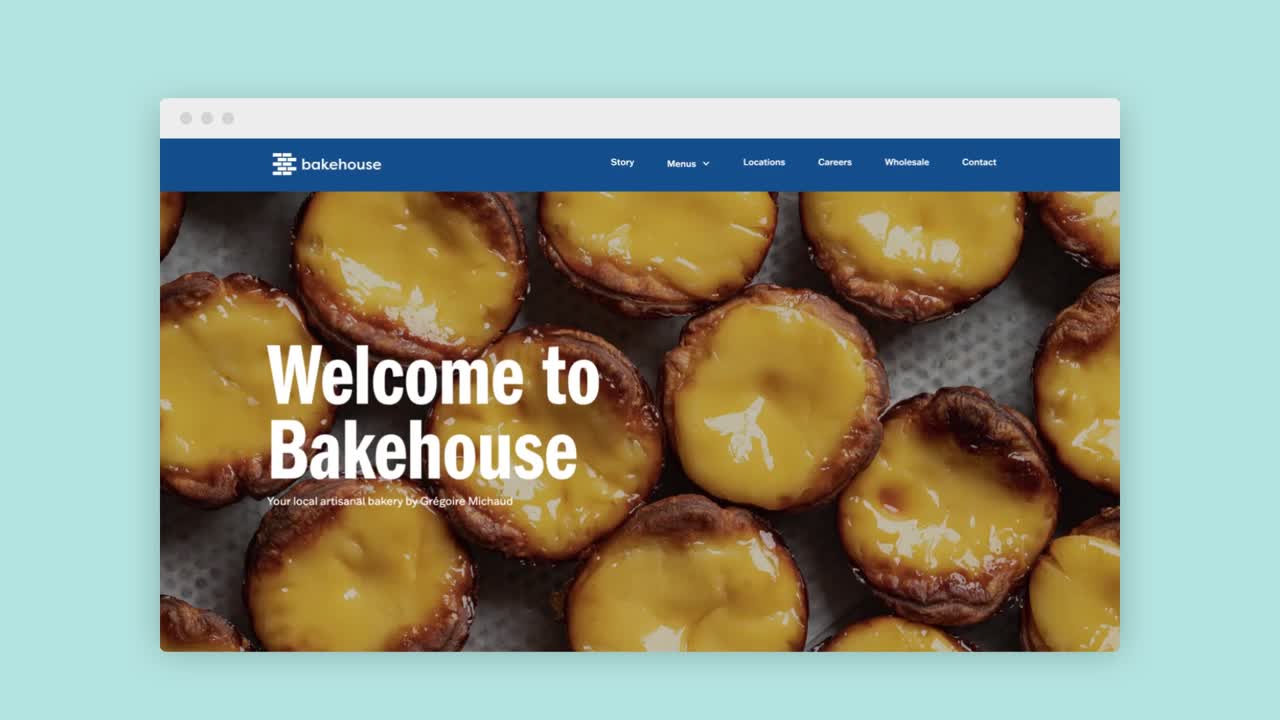
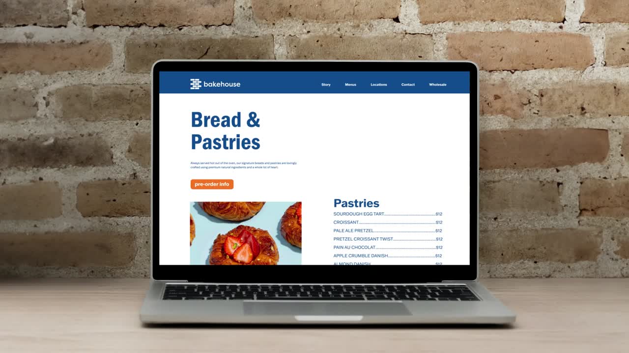
The site predated Bakehouse’s rebrand, underusing its iconic illustrations and failing to capture the warmth of the in-store experience. It also lacked mobile optimization, leaving on-the-go users with clunky navigation.
2. A one-size-fits-all approach to user needs
Customers, wholesale partners, and job seekers were funneled into one generic contact form, overwhelming the team and creating a disjointed, inefficient experience.
bringing bakehouse’s character to the screen
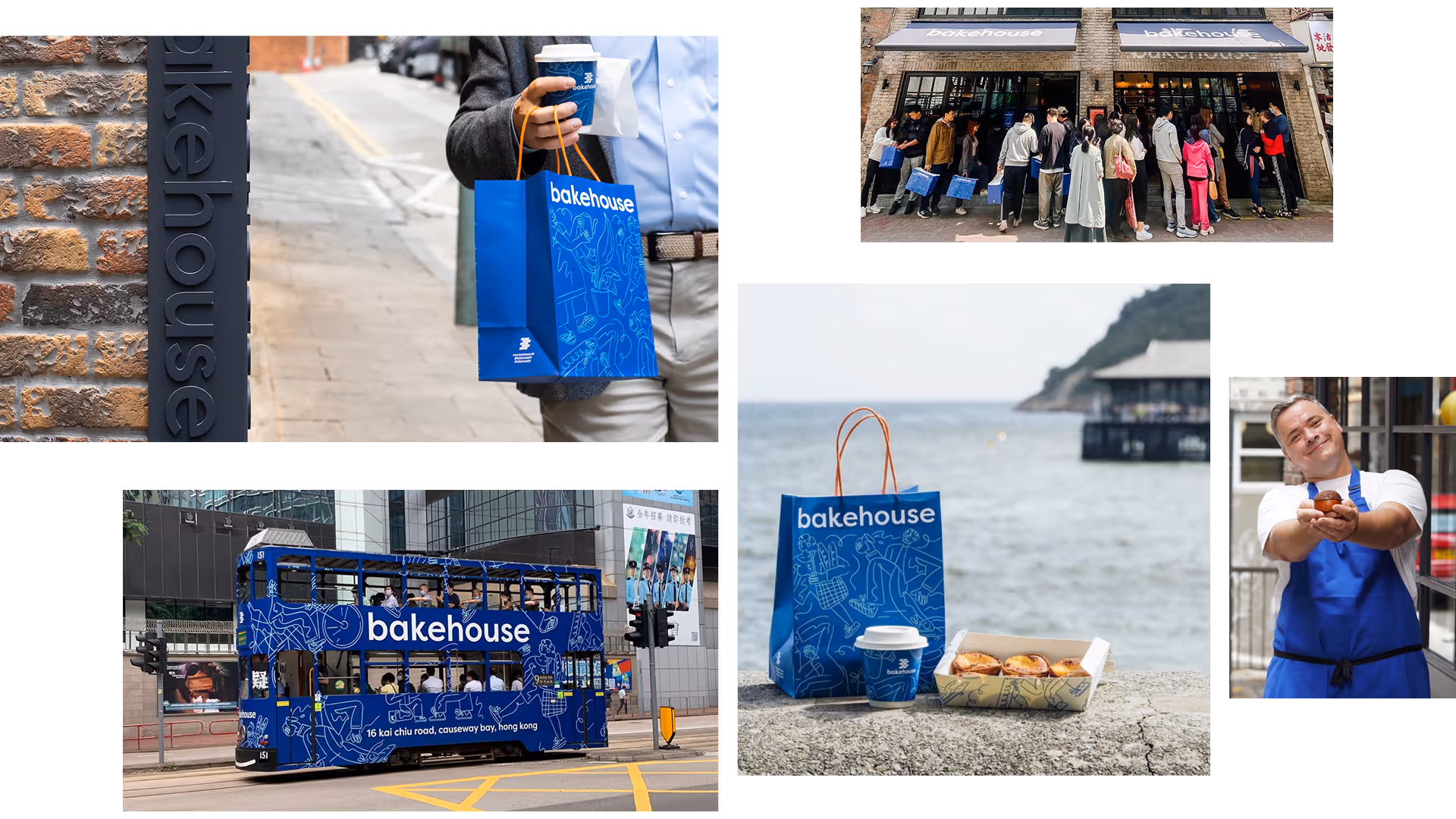
To translate Bakehouse’s charm into digital form, I placed its beloved illustrations at the center of the experience and implemented them in Webflow with my first use of Lottie animations. This not only brought playful motion into the site but also ensured consistency across devices.
Illustrations, front and center — Signature illustrations were animated to add life and delight across the site, from loading states to key visuals.
Lottie-powered animations — Lightweight animations kept the site responsive across mobile and desktop.
Micro-interactions for delight and feedback — Hover, scroll, and loading effects added warmth while giving users meaningful feedback.
restructuring the website around users
I mapped Bakehouse’s core audiences and designed dedicated paths that replaced the cluttered catch-all form, tailoring the experience to specific needs.
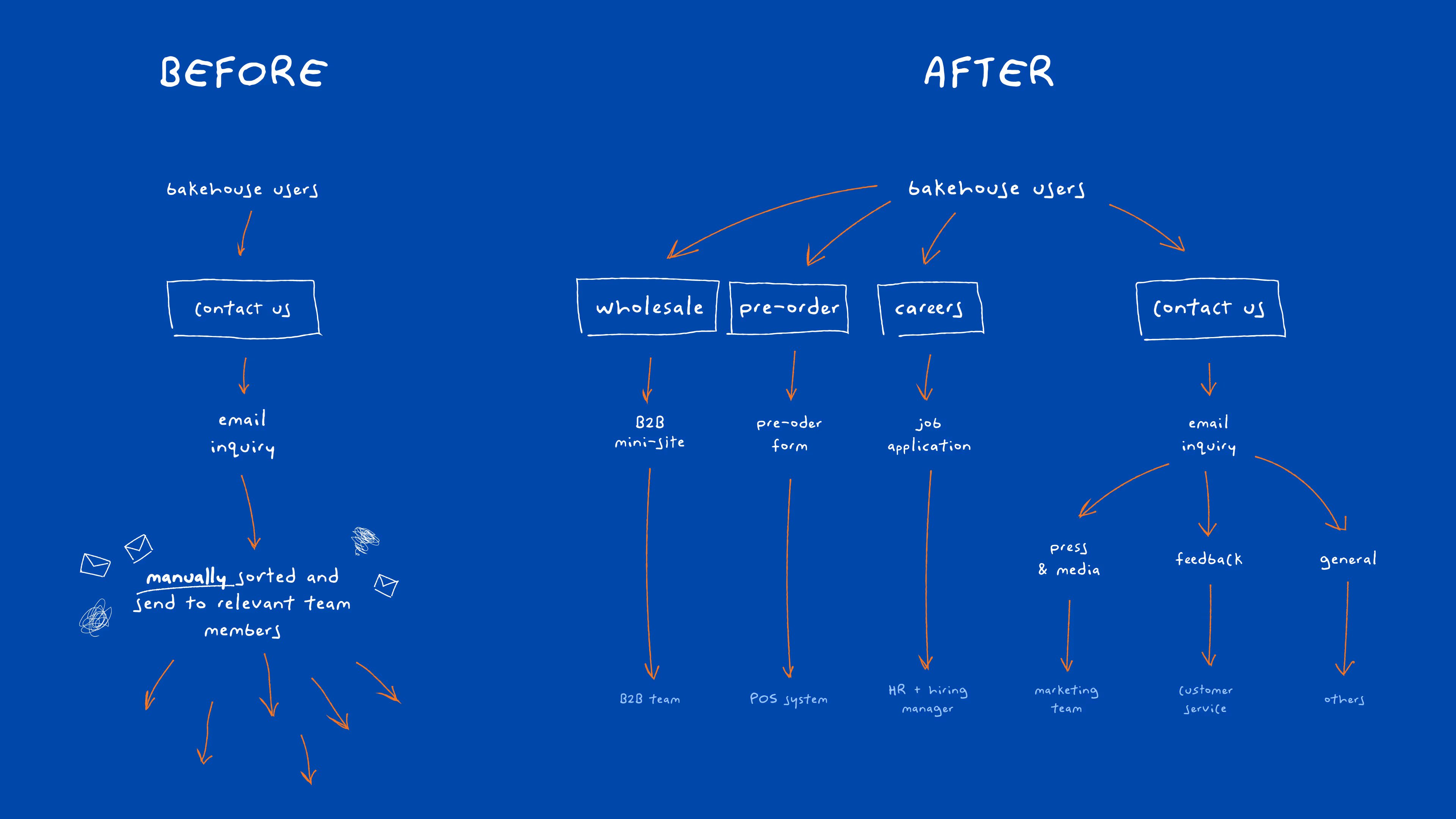
Pre-orders & large orders (Customers) — A “Skip the Line” flow let guests place larger or time-sensitive orders in advance.
Careers (Job Seekers) — A “Join the Team” section highlighted culture, open roles, and sent applications directly to HR.
Wholesale (B2B partners) — A linked microsite provided bulk pricing, product specs, and streamlined forms to the wholesale team.
Other inquiries (Feedback, Press, Media) — A smarter form routed press, feedback, and media requests to the right groups.
By restructuring around user needs, Bakehouse dramatically reduced inbox clutter and manual sorting. Freeing staff to focus on baking and serving exceptional experiences.


looking back (hats collected)
The biggest challenge and learning was how to use motion thoughtfully. It’s tempting to treat animation like a showpiece, but here it had to be subtle, supportive, and consistent across desktop and mobile. Striking that balance was powerful: done right, motion added warmth and personality without overwhelming the experience. Looking back, I would create reusable animated components for the Bakehouse team. Growth inevitably brings change, and giving them flexible tools would make it easier to evolve the site without losing its charm.