deploy app
in a nutshell
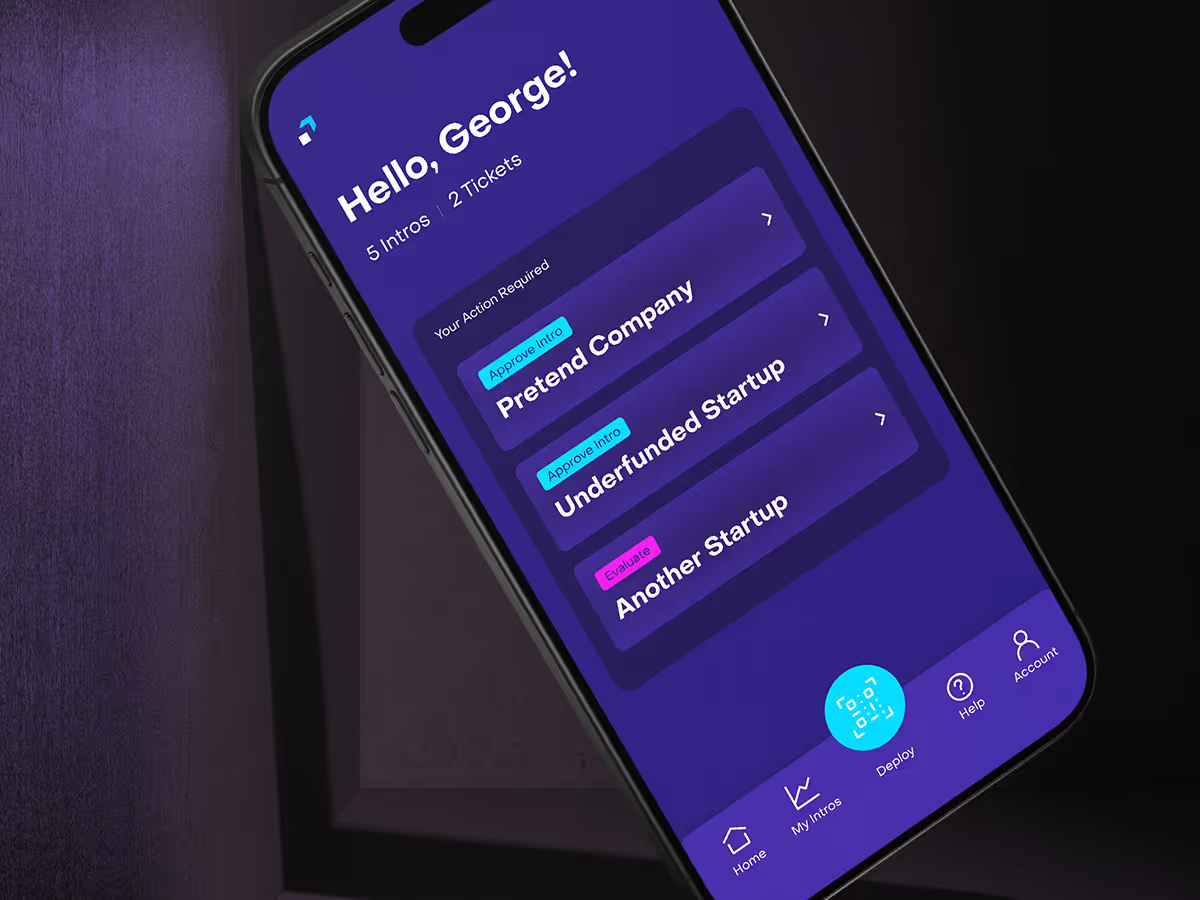
The Deploy App is the central hub of Deploy’s investment pipeline. Where entrepreneurs submit companies, and recruiters and specialists evaluate them before they reach investors. Serving a diverse mix of users, the app streamlines the pre-investment process, making it easy to submit, review, and rate opportunities.
As the sole designer, I led the entire redesign from user research and flow mapping to UI design and prototyping with the goal of pairing functional clarity with Deploy’s bold, innovative brand. The result is a cohesive, intuitive experience that empowers users to navigate complex workflows with confidence.


the challenge
When Deploy first launched its app, the experience left users confused, unsure of their role, and struggling to navigate. Three main challenges shaped the redesign:
1. Not understanding different user needs
Entrepreneurs, scouts, and expert reviewers all faced the same generic flow, forcing them through irrelevant steps and creating uncertainty.
2. Fragmented, multi-platform flow
The process spanned multiple platforms, from webpages to emails to the app. With unclear navigation and actions, breaking user focus.
3. Inconsistent design and UI
Mismatched styles, weak hierarchy, and disconnected touchpoints eroded trust and made the experience feel disjointed.
understanding the users type
A key step in the redesign was understanding the three distinct user types and their roles in the Deploy network:
Entrepreneurs – founders outside the network seeking investment.
Scouts – members who identify and introduce promising companies.
Experts – specialists who evaluate and approve opportunities.
By mapping these roles, I created tailored flows that surfaced only relevant actions and cut unnecessary steps. This reduced friction and gave every user a clear, confident path through the process.
simplifying the flow
Once the roles were defined, I redesigned the architecture to eliminate confusion and fragmentation.
Reducing platform-hopping — I combined steps previously spread across emails and multiple webpages into one centralized app experience.
Segmenting user journeys — I designed unique flows for entrepreneurs, scouts, and experts, keeping each focused on only what mattered to them.
Clarifying navigation and next steps — I applied clear hierarchy, labels, and feedback states so users always knew where they were and what was next.

creating a cohesive UI library
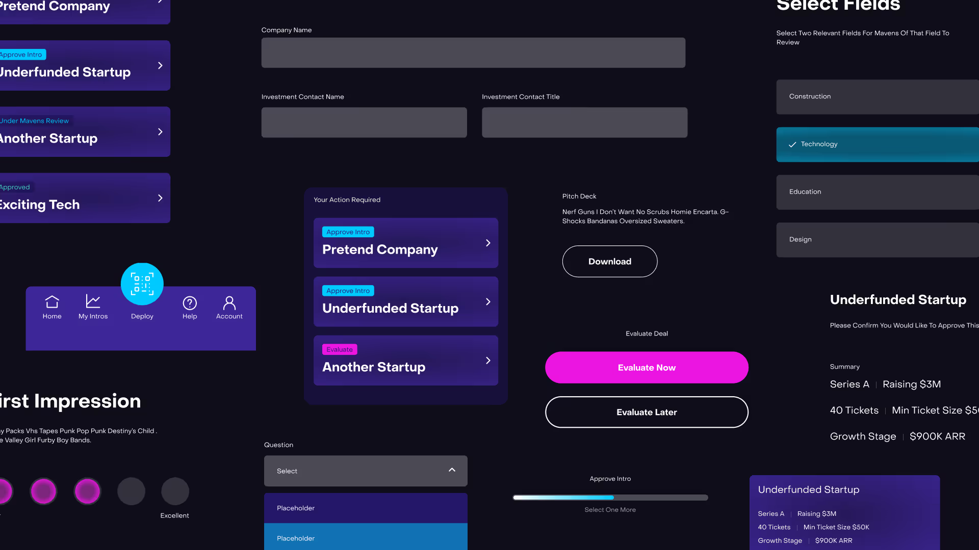
To fix inconsistencies and improve scalability, I designed and documented a new UI library.
Building a unified UI system — I created reusable components, patterns, and typography rules for consistency across platforms.

Tailoring to user needs — I adjusted branding levels: minimal, functional surfaces for experts; more playful touches for entrepreneurs and scouts.
Minimizing visual clutter — I applied brand elements thoughtfully, balancing clarity with character.
This system not only unified Deploy’s digital presence but also gave the team a scalable toolkit to support future growth.

looking back (hats collected)
Being the sole designer sharpened how I communicated with non-design stakeholders. Flow diagrams, prototypes, and extra context ensured my intent was clearly understood. I also saw firsthand how product familiarity can blind teams to usability issues. Designing distinct flows for entrepreneurs, scouts, and experts helped reveal gaps the client had overlooked. If I were to do it again, I’d push harder to involve stakeholders in UX conversations earlier, since many frustrations could have been avoided by prioritizing usability from the start.


