chegg design system
in a nutshell
Chegg’s experience had become fragmented, visually, structurally, and organizationally, as teams worked in silos with multiple, outdated design systems. Inconsistencies across marketing, web, and mobile weakened trust and clarity for users, while limited cross-team communication led to duplicated work.
This wasn’t a rebrand, but a refinement: an effort to unify the brand identity and improve collaboration. Partnering across product, brand, and engineering, I co-led the creation of one shared system, with a single Figma library, Slack channels, cross-team meetings, and scalable design tokens. The result was a more cohesive user experience and stronger alignment across the company.
the challenge
Chegg’s design system lagged behind the pace of its growing product. As teams worked in silos with their own tools and priorities, inconsistencies piled up, duplicated work was common, and the user experience fractured further.
1. Multiple systems, misaligned teams
Different groups relied on separate or outdated systems, sometimes creating their own. Without shared foundations or communication, fragmentation only grew.
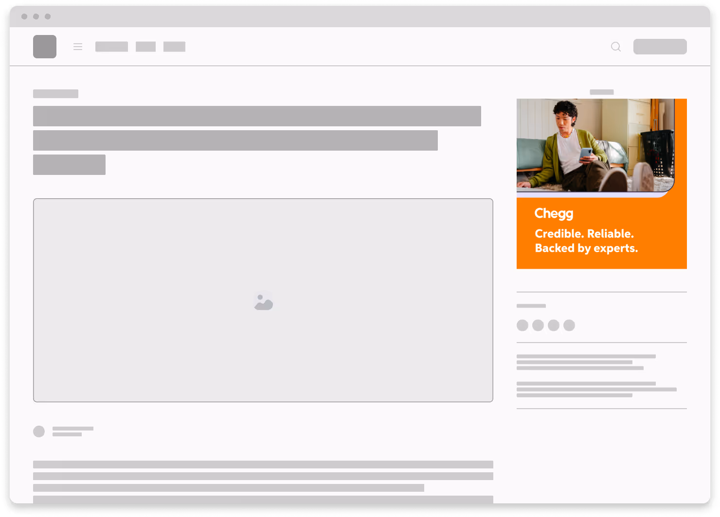
2. Inconsistencies across user journey
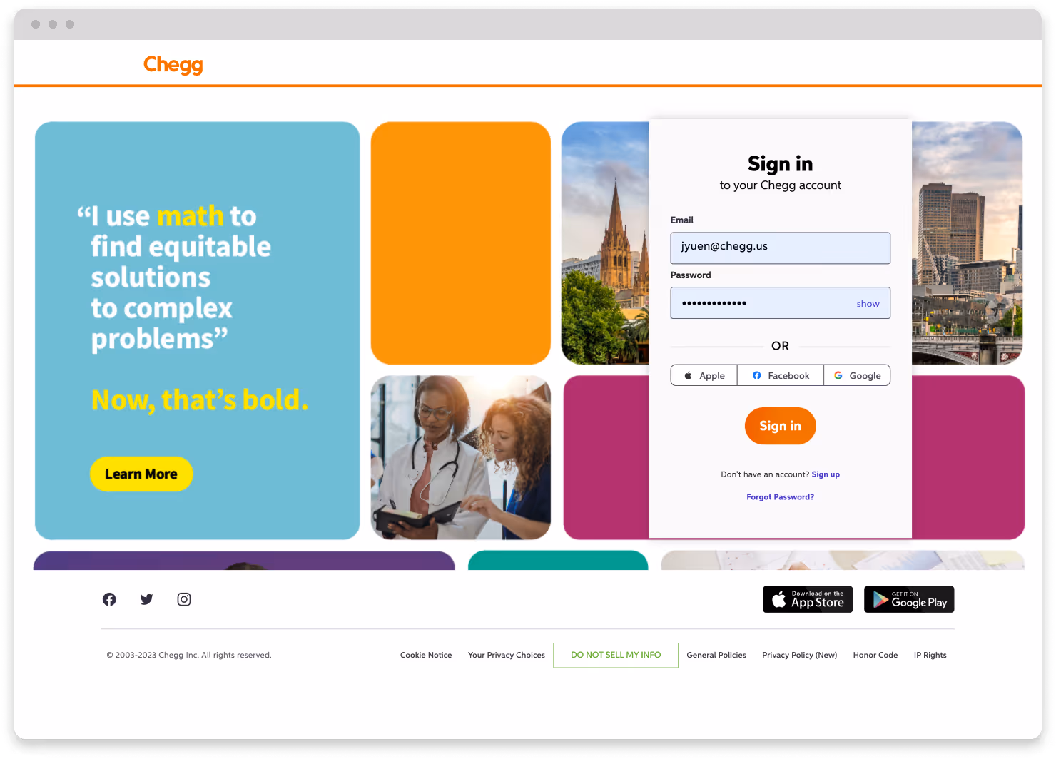
Typography, color, layout, and tone were applied differently across surfaces, diluting brand clarity and confusing users.
3. Not built for scalability
The legacy system was too rigid, making even small updates costly for design and engineering.


bringing teams onto one system
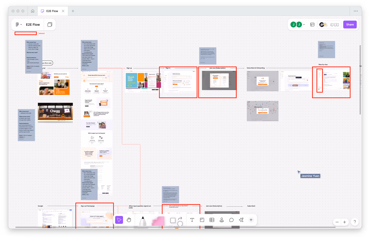
We united teams around shared tools and communication practices. I co-led a joint audit with brand and product design, uncovering disconnected libraries and legacy systems still in use.
Improving cross-team communication — I helped introduced a company-wide design Slack channel and helped set up recurring meetings with reps from product, brand, engineering, and marketing to align priorities and flag overlaps early.
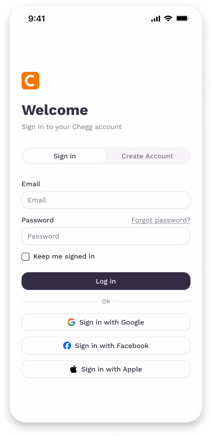
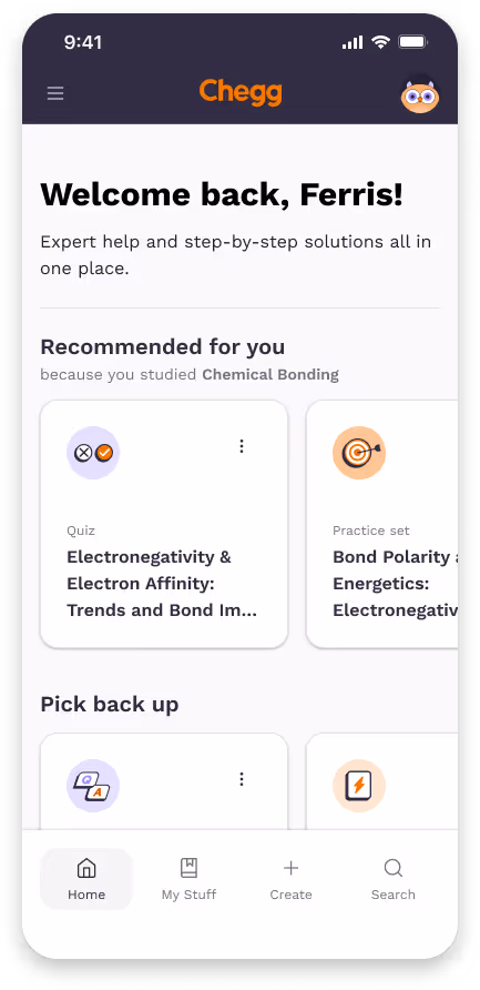
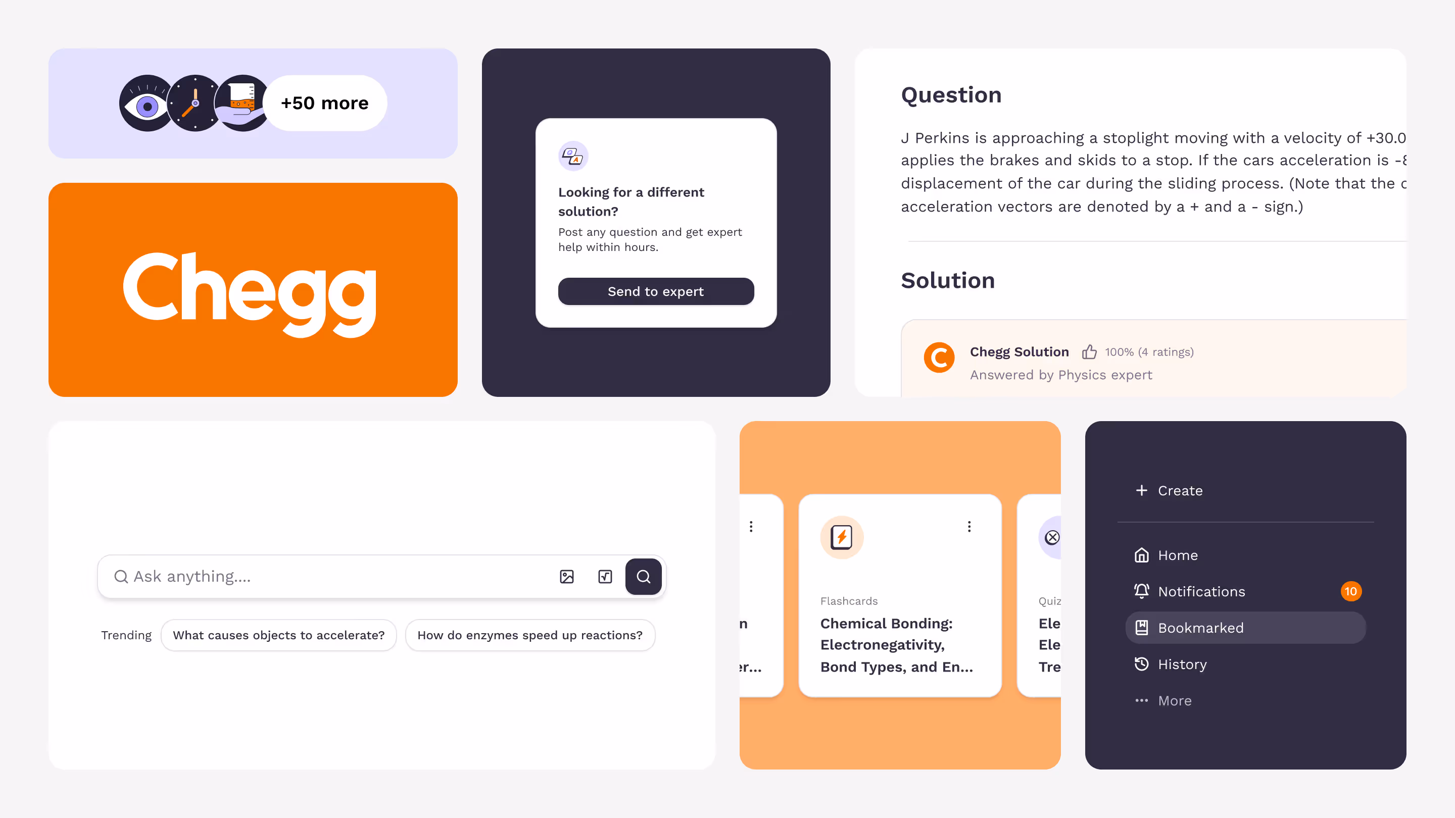
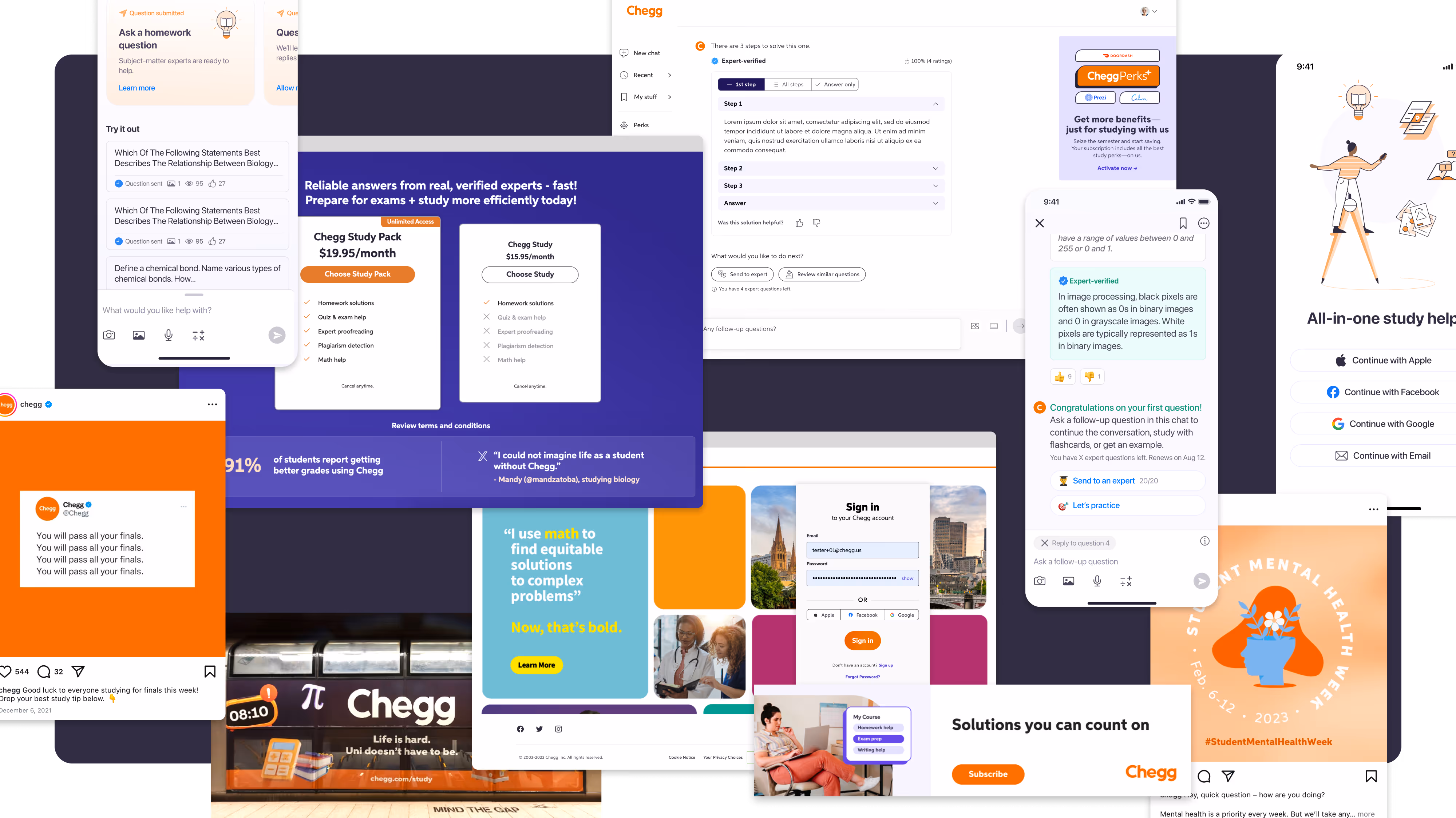
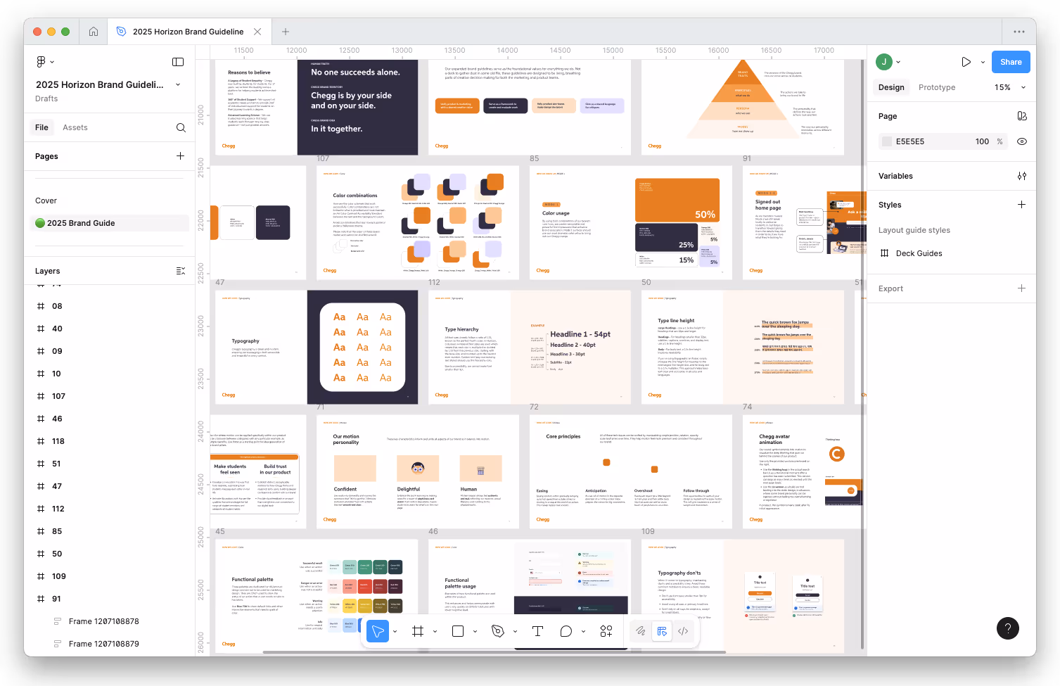
Unified Figma library — I built the shared Figma system, unifying foundations for web and mobile so teams could design and hand off more consistently.
Shared ownership of the design system — I helped structure a cross-functional group to maintain and evolve the system over time.
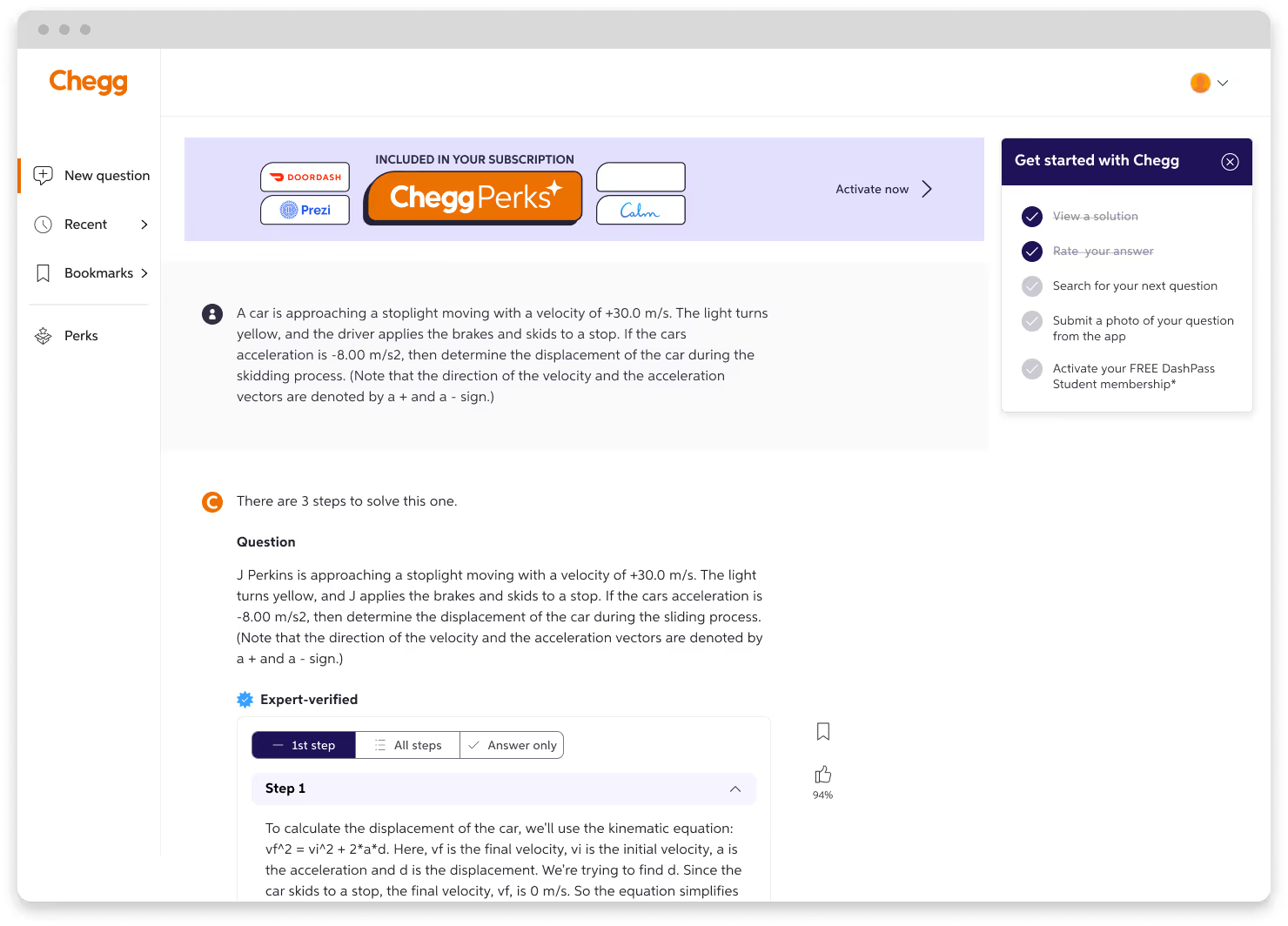
creating consistency across the journey
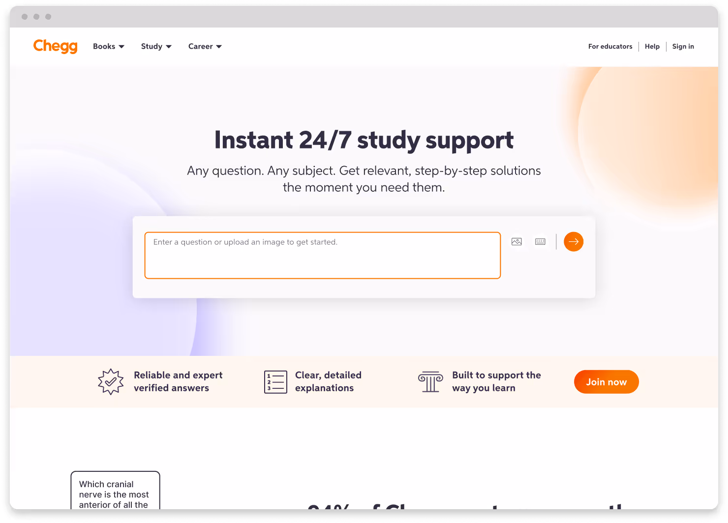
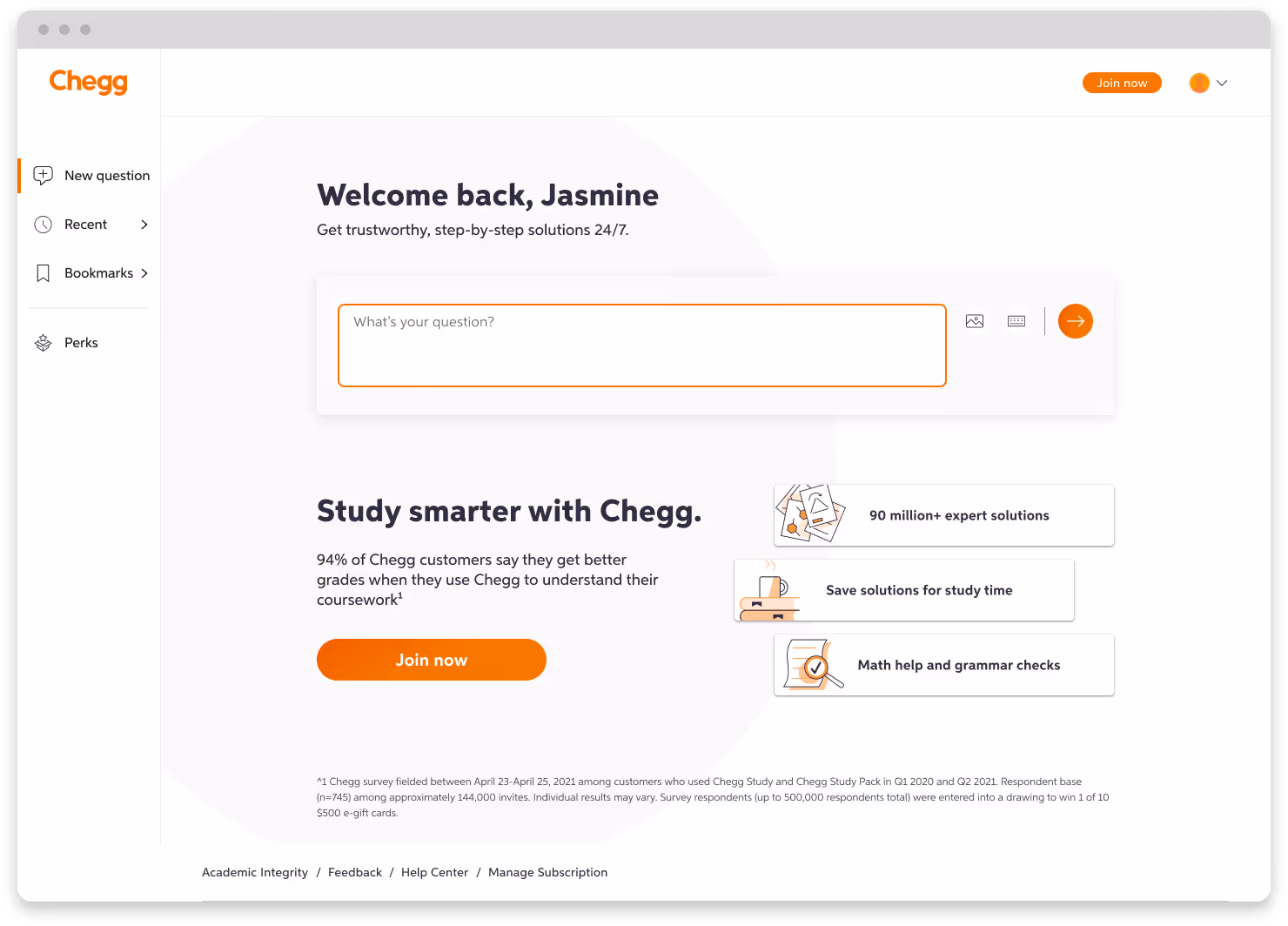
Even though teams pulled from the same brand system before, differences in color usage, Chegg’s teams applied the same brand system in very different ways. I worked directly on refining and extending design rules to bring consistency back across platforms.
Inconsistent color usage — Defined clear roles for Chegg’s palette, smoothing abrupt shifts between marketing and product.
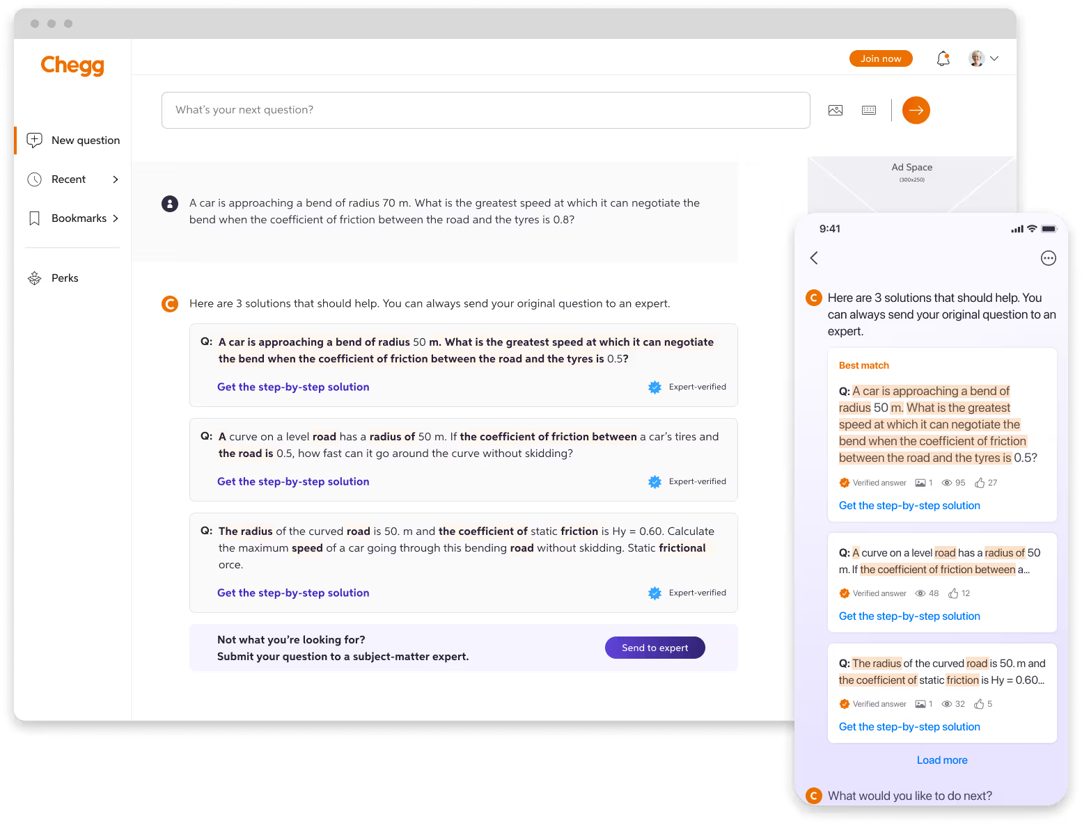
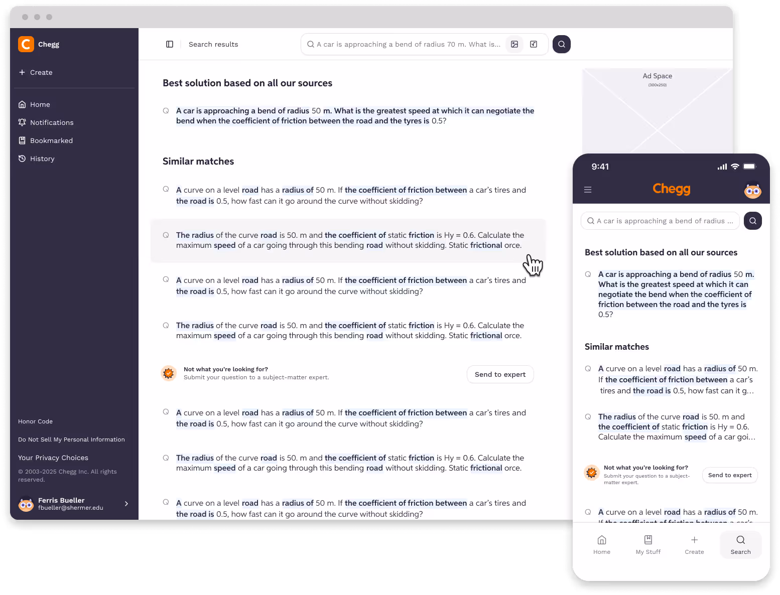
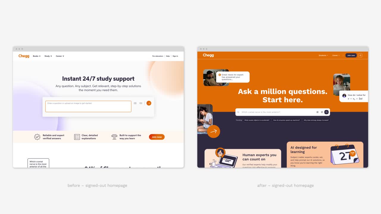
Hierarchy through type and layout — I refined type styles and introduced new layout rules to make pages more structured, scannable, and accessible.
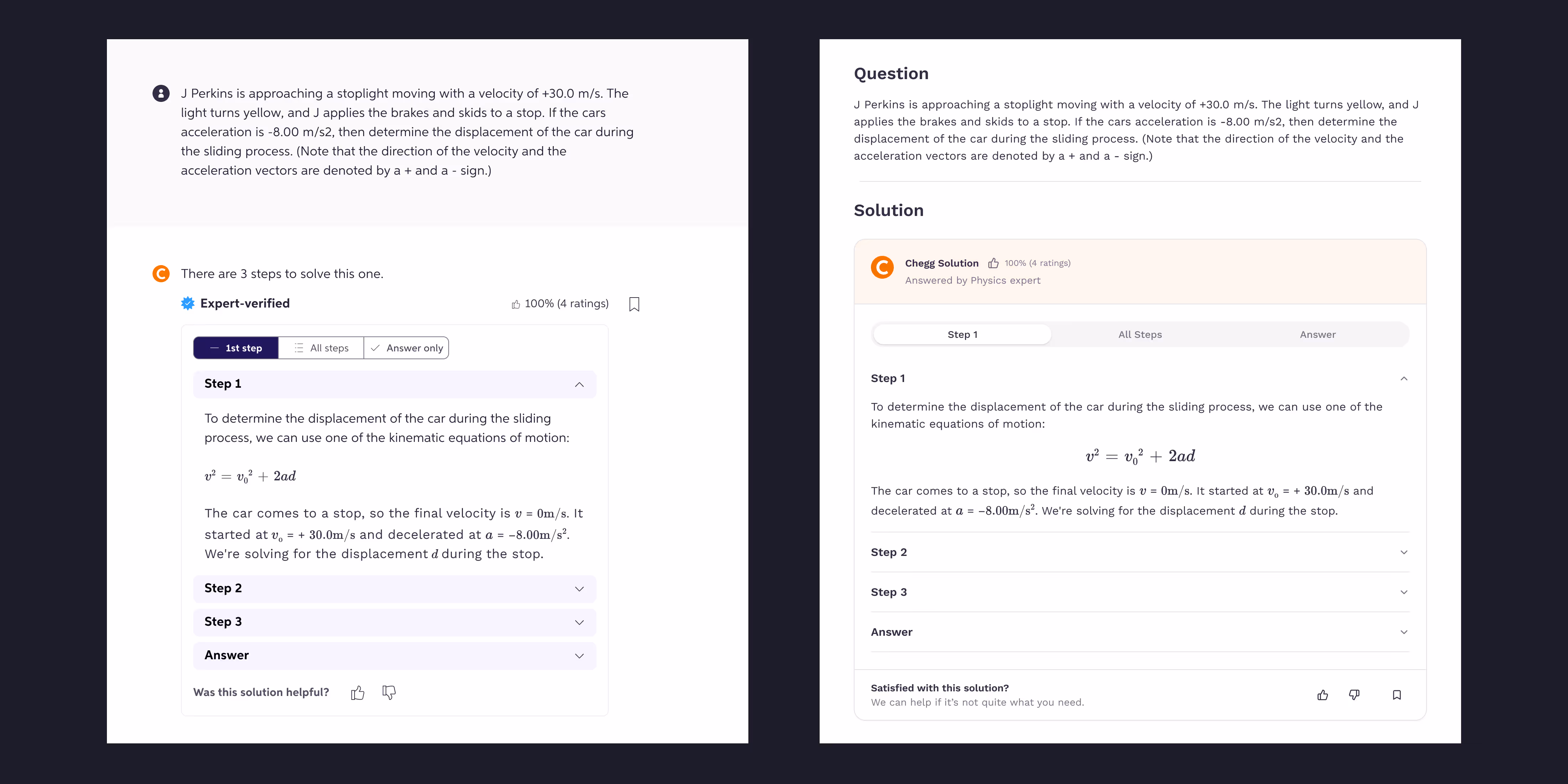

Brand presence beyond color — Partnered with marketing to extend brand presence through illustrations, icons, and motion, reducing over-reliance on color alone.
designing for scalability
The system needed to grow with Chegg’s evolving product. I partnered closely with engineering to create foundations that scaled.
Standardized foundational rules — We set consistent rules for type, color, and spacing, creating a flexible yet unified base.Established consistent type, color, and spacing guidelines, turning them into reusable tokens.
Engineering collaboration — I worked side by side with engineers to implement a token system that streamlined development and reduced custom builds.
Shared ownership — Helped set up a shared ownership model with leads from each discipline to keep the system aligned and relevant.
looking back (hats collected)
If this project reinforced one thing, it’s that a design system is only half design, the other half is people. Bridging silos across UX, marketing, and engineering was just as important as fixing color palettes or type styles. In hindsight, I would have hosted casual “lunch & learn” workshops to help designers, especially junior team members feel more confident applying the system and ensure everyone shared the same foundation in design principles. Next time, I’ll put even more energy into documentation, onboarding, and communication because the success of a cohesive design system relies as much on people as it does on being pixel perfect.